Industry
2019
Client:
MoMA
Deliveries:
Brand identity
Environmental graphics
Print collateral
Vitrine/window typography
Gradient panel
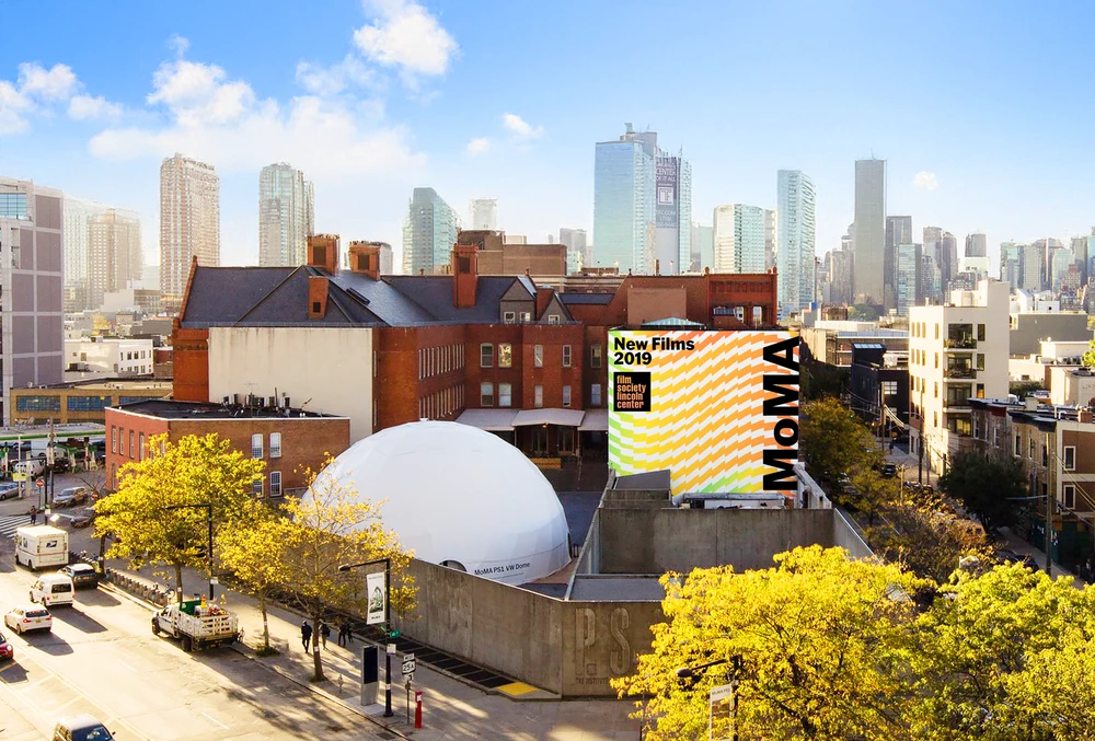
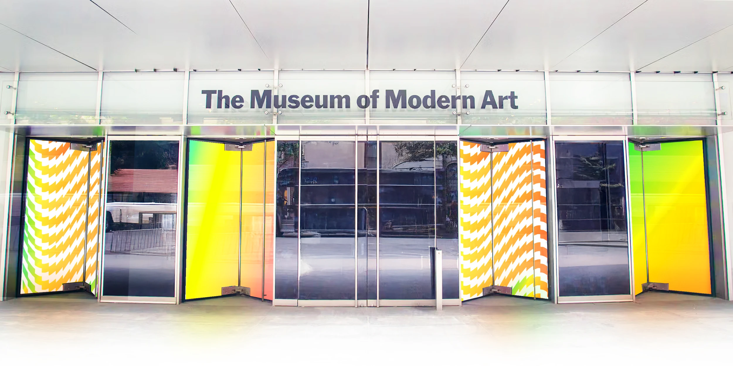
MoMA's programming changes constantly — one month it's Cubism, the next it's video art — so a single fixed identity would either say nothing or fight the work on the walls. Our strategy: don't design one look, design the system that generates every look. A flexible color palette shifts with each exhibition, a single graphic pattern holds it all together at every scale, and a quieter typographic voice steps in for warmer moments — giving MoMA an identity that changes with the museum instead of against it.